<!-- Animated Portfolio Card -->
<div class="portfolio-card">
    <div class="glow-effect"></div>
    <div class="card-content">
        <h2 class="glowing-text">Hello World!</h2>
        <div class="animated-box"></div>
        <button class="magic-button">Click Magic!</button>
    </div>
</div>

<!-- Typewriter Effect -->
<div class="typewriter">
    <h1 id="typewriter-text"></h1>
</div>

<!-- Particle Background -->
<div id="particle-canvas"></div>
Vineet Singh Chandel
~ 1st Year B.Tech — B.Tech Computer Science Engineering
📍 Kanpur, Uttar Pradesh
vineetsinghchandelofficial@gmail.com
+91 9389205207
Professional Summary :
1st-year B.Tech CSE(core) student.
Skilling myself in DSA(c++), Backend. Passionate about building impactful systems
and seeking opportunities to contribute to real-world projects.
Education
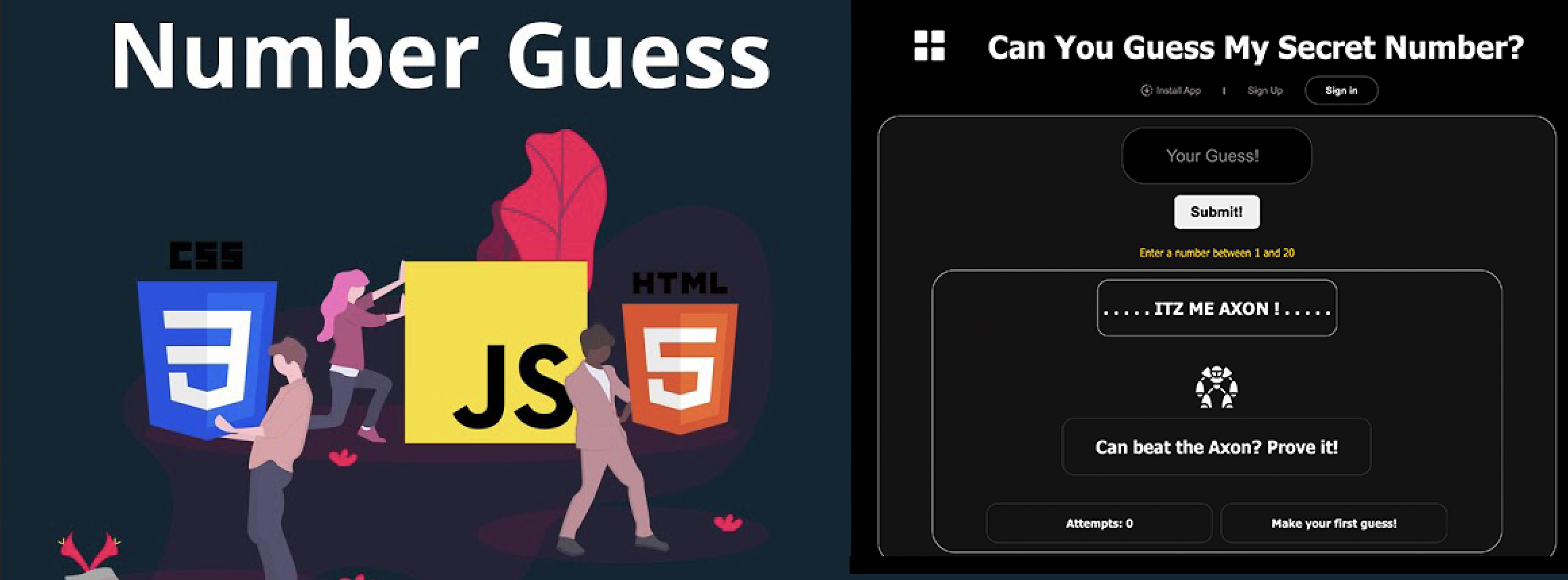
♠ Web Technologies
𒆜 HTML-CSS
𒆜 JS
𒆜 NodeJs
♠ Coding languages
𒆜 C++(DSA)
𒆜 C
𒆜 Python
♠ Libraries
𒆜 GSAP
𒆜 Tailwind
𒆜 Bootstrap
♠ Databases & Tools
𒆜 Git-GitHub
𒆜 MySQL
𒆜 MongoDB